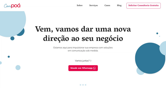
a new website as their old one has failed sharing their message and bringing new clients. I was excited because Compoá is a marketing agency made from women that empowers women-led companies. They needed a completely new design to their website.
The challenges were initially
At the beginning of the Sprint, it wasn’t clear what they offer and how their services works
They weren’t reaching their target audience
Then our design sprint revealed
What services Compoá does
Communication Consulting,
Content Marketing
Design Sprint
Who their users are
Entrepreneurs women who wants profiting with social media and feel fulfilled with their business
What image they want to have
Incisive
Cute
Modern
The user’s problems
Lack of direction and clarity: don’t know what to do next with their business and how to do it
Lack of time to do everything alone
Can’t invest much money on their business
We are seeking the user’s transformation
From someone
Uncertain with their own business
Doubt about herself
Just one more in the market
To someone
Confident with their own business
Recognition and autority in their niche
Open to receive help
and the main challenge:
How might we be a guide for women in the entrepreneurial
field
User
, helping them define the next step of their
business?
Challenge
So we came up with a few concepts, and picked this one:
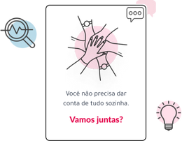
We chose that one because
It shows empathy
You don’t have to do everything alone
We understand how hard it is to have a small business in Brazil with limited resources
As a women, we deal with some problems that only we know how it is
It gives a plan
You can talk with us about your business
We will find what is the best service for you
You will see your business growing in a sustainable way with strategy and confidence
You have who to count on during your journey
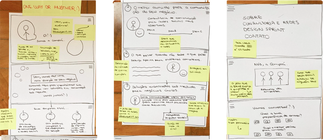
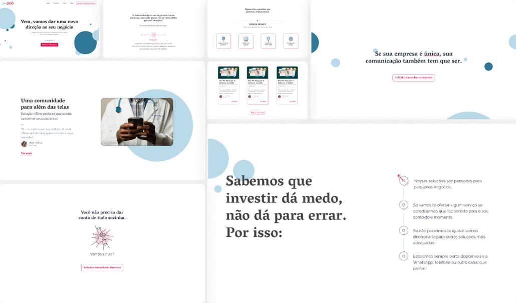
With the wireframe done, the next step was to define the visual direction
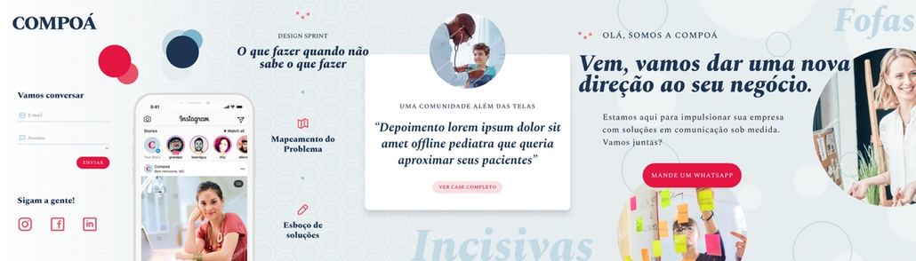
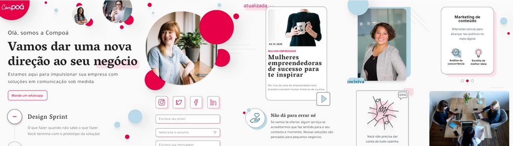
We created two different stylescapes according to what Compoá wanted as their image (incisive, cute and modern) and considering all details we got about them on the Design Sprint
Stylescape number 1
Stylescape number 2
Compoá decided to keep the stylescape number 2
Typography
Vesper Libre was the chosen font to represent their “trust” and “business” side. It is a classic font, but still entirely modern (just as Compoá).
Colors and elements
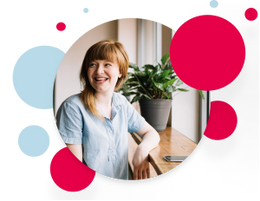
Compoá asked us to keep their colors pink and blue, as well as their logo element, circle. With pictures of strong women, the combination between those 3 elements is a sweet and strong, dynamic interface.
Icons and composition
We chose to work with thin lines and icons, so they keep the friendly and serene aspect we need. Here we want the user to feel welcome, and that they are in a safe space where they can trust us.
With the wireframe and stylescape defined, I was able to create the website