Runaware

Mobile App Research UX UI

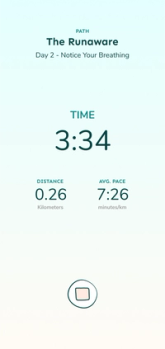
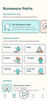
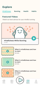
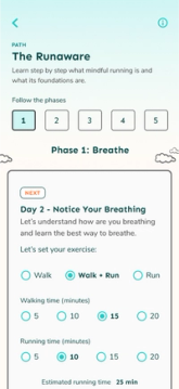
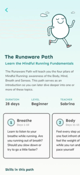
  Runaware's home

We started with an idea:

creating an app to help people cultivate the habit of running with mindfulness. I was excited about this project because, even though there are many running apps outside, Runaware would be the first one to use mindfulness as the main approach.

The challenges were initially

  • Deal with a running habit without affecting the mental health of our users
  • Bring presence and intention to the running

but we needed to better understand the project

Our high-level goals

  • Show that running is not as hard as it seems
  • Influence runners to take care of their minds
  • Develop a mindful engaging interface/experience

The user and their problem

People who want to start running, run, or stopped and want to return. They can't find the motivation and discipline to create the habit.

and what people think about existing running apps

  • People love guided runs and simple plans or paths to follow when running
  • They don't like how existing apps try to keep them engaged today, and so they get bored faster

so our main challenge is

How might we help new and casual
runners
User
, find the motivation and discipline to create a healthy running
habit
Challenge
?

We then conducted detailed user research with

  • interviews and online surveys

  • personas, empathy maps

  • journey maps and storyboards

and our research revealed some surprising stuff, like

The 3 main fears of our users about running

1. Lack of discipline

They are frustrated about how difficult it is to build the habit and not having the discipline to commit to new things. It happens before and during the run.

Triggers: thoughts of not being good, laziness, preparation time, bad weather/running track, people.

2. Slow results

They don't see results, think about doing something easier, and are worried about what people think. It happens during and after the run.

Triggers: seeing stats after a run or other people running, thoughts of never getting better.

3. Lack of physical condition

They don't have physical conditions, are running out of breath, don't know their limits, and push too hard. It happens before and during the run.

Triggers: thoughts of not being a runner, preparation time, pain before/after the run, past situations.

Ok, but given all of this, how can we help our users?

with Marindfulness 🧘🏼

When you bring mindfulness into your run, your mind connects with your movement and avoid you from being distracted by people, noise, technology, and cultural pressures. We are able to help our users while working on their fears in a smooth process.

🧠 time to brainstorm 🧠

Which content/features would help new and casual runners fight their fears and create a healthy running habit in a mindful way?

We need to make running obvious

  • "Preparation Checklist" a night before the run
  • Engaging notifications

We need to make running attractive

  • Setting up intentions
  • Pre-run ritual

We need to make running easy

  • Trial run explaining Runaware methodology
  • Mindful running paths with guided runs
  • Setting up preferences for each run
  • Recommend content according to the user's needs

We need to make running satisfying

  • Non-regular stats to follow how you feel
  • Awareness skills for each completed run
Runaware information architecture

After working with the user flow and information architecture, we came up with a few concepts and picked this one:

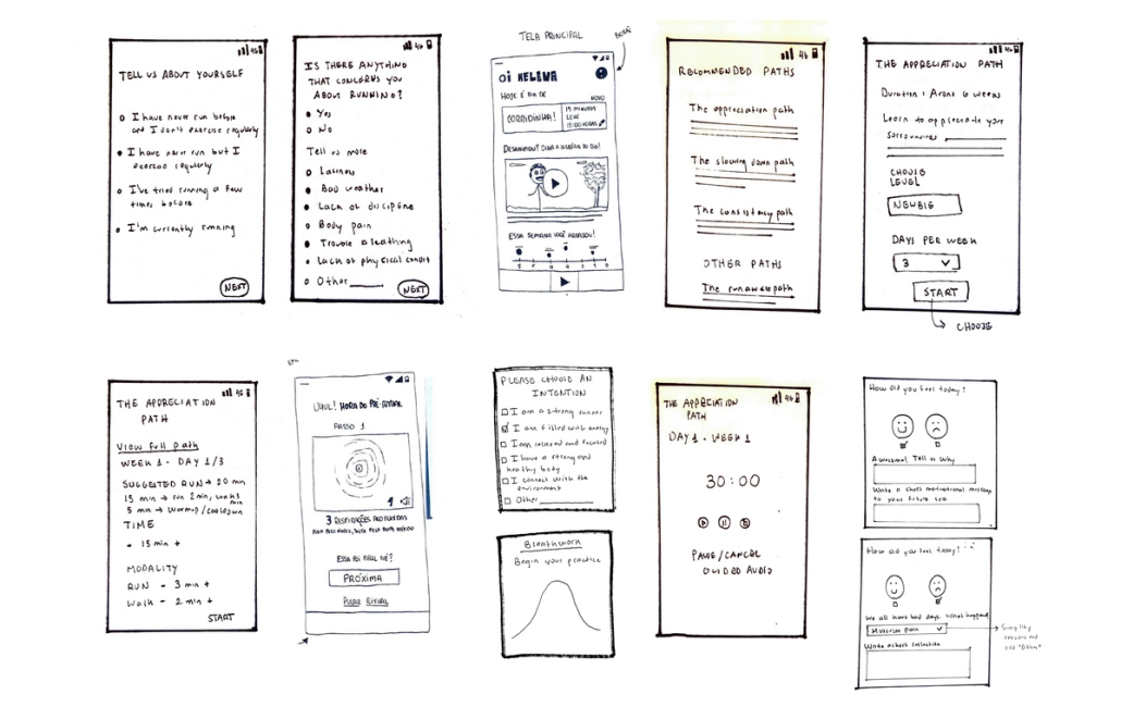
Wireframes of the Runaware app

With the low-fidelity prototype done, we defined the visual direction

  • Friendly
  • Inclusive
  • Clean/Calm
  • Warm/Cozy
  • Positive/Encouraging
Stylescape Runaware
Winner Stylescape

Typography

Sen was the chosen font to represent Runaware’s human side. It is a sensible font with a friendly look.

Colors and Elements

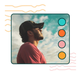
The palette has warm and calm options. The “lines” element represents the running movement but with no perfect lines, just like a casual runner's path.
Icons and composition

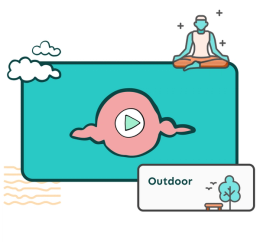
We chose to work with thin lines and strokes, keeping the friendly and calm aspect we need. With cute human icons, the user will feel welcome in a safe place to breathe.
and you can find the rest of the story here

Some more projects